Can you have your cake and eat it too? Or: can you have more information in an exhibition than ever before while still putting the objects in the center?
Most of us who work with digital solutions are aware of the benefits with interactive screens. All information does not have to be visible at once. There’s no need to choose between depth and width. A first level can be concise and easily accessible, while more details are only a click away. Dealing with different languages also becomes much easier. No physical limitation forces other languages to a subordinate place. The different language versions can exist in parallel and be equally detailed. You can work with video and interactivity and with sound if you want. Another advantage is that the content can be updated much easier than it would be using printed signs.
Despite all the obvious benefits, it is not easy to come up with a solution that really works. During the work on the Swedish History Museum’s new permanent Viking exhibition, The Viking World, the question of digital texts came up at an early stage. Could we avoid printed texts altogether? In that case, in what way would this be done without the exhibition feeling like a sea of glowing screens? With almost 100 displays and thus the same number of touch screens, it is absolutely crucial that there is a easy way to monitor all devices. Where could we store the information and how should it be updated? We had quite recently started implementing a new collection management system, but the shorter and longer texts that were not related to individual objects had no natural place there. Our photographers planned for extremely detailed images of all objects but the DAM system that was under procurement was not yet in place. Yes, as you can see, there were a lot of things to solve!
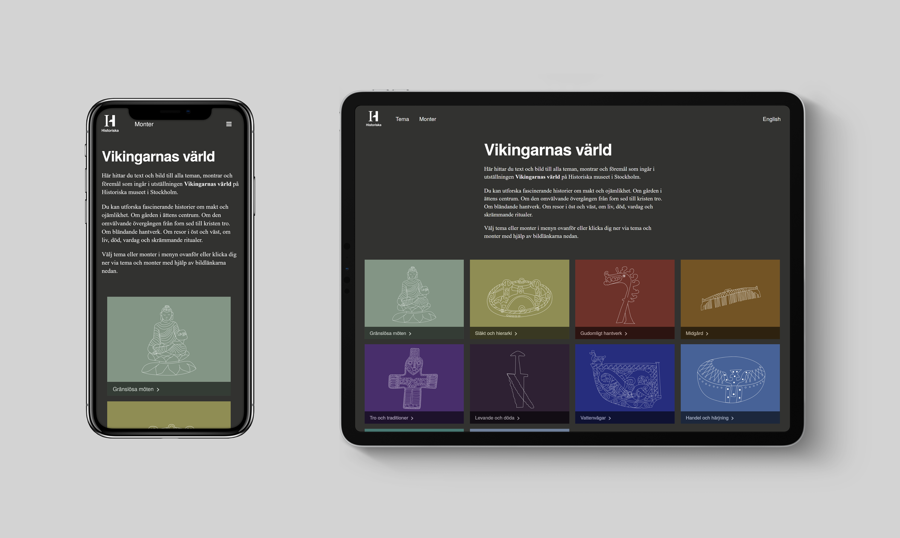
Examples of what it looks like in mobile and tablet
We also wanted the information to be accessible via the visitors own mobile phones, iPads or computers, which was one of several reasons why I advocated a web solution. At the same time, it was important that the touch screens did not feel like a web page with load times but more like an App that provides direct response to interaction.
The hardware in the museum
If you choose to avoid printed texts all together, a screen is required at each display case. It is not possible to completely rely on visitors to use their own mobile phones. The touch screen manufacturer ELO has an interesting solution consisting of a fairly small and relatively cheap “player”, capable of displaying web pages as well as apps and above all important, monitorable via a web interface! Thanks to the fact that we always have some production going on at one of our six museums, we were able to test drive the solution. In the exhibition Speaking memories, there was a need for a touch screen with a few videos. After using the equipment for about six months without any problems, I dared to take the step and order 100 ELO players to the Viking World exhibition.
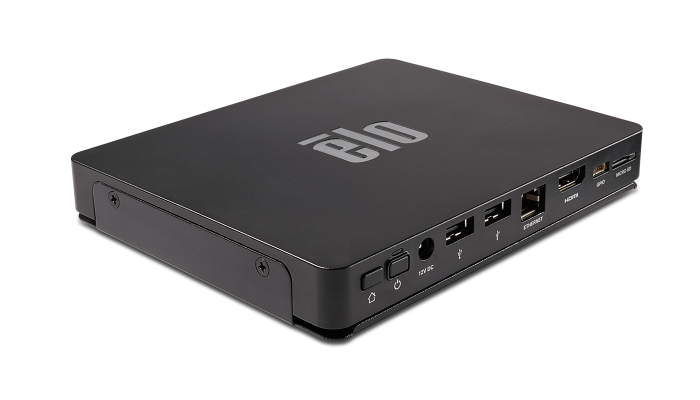
Elo Backpack Android compute engine
Now we needed to think about what type of touch screen was appropriate and how we would mount them in the best way, so that they became accessible and easy to read without taking too much visual focus in the room. Fortunately, there are always wise and committed colleagues to consult and not least the exhibition designer Atsuko Hamanaka Brandt. Atsuko’s experience in accessibility was invaluable. The exhibition consists of a number of different display types, so we needed to find three different mounts. A standing model, a variant for wall-mounted screens and one for table mounting. ELO’s touch screens allow a technology that keeps the click function even when you place a glass up to six millimeters thick on top of the screen. This allowed us to mount the screens into the tables and get a completely smooth surface. Screens and players take up so little space that visitors with wheelchairs can easily get their legs under the table surface. In addition, the flat mounting means that the screens do not become too intrusive, visually, but still clearly readable when you get close.
Many screens today have 16: 9 format adapted for film. We did not think it was a suitable format for our purposes and preferred a screen with aspect ratio 5: 4 and 19 inch size. Big enough to be clearly readable from a distance but small enough to be mounted in the places we wanted.
Overall concept
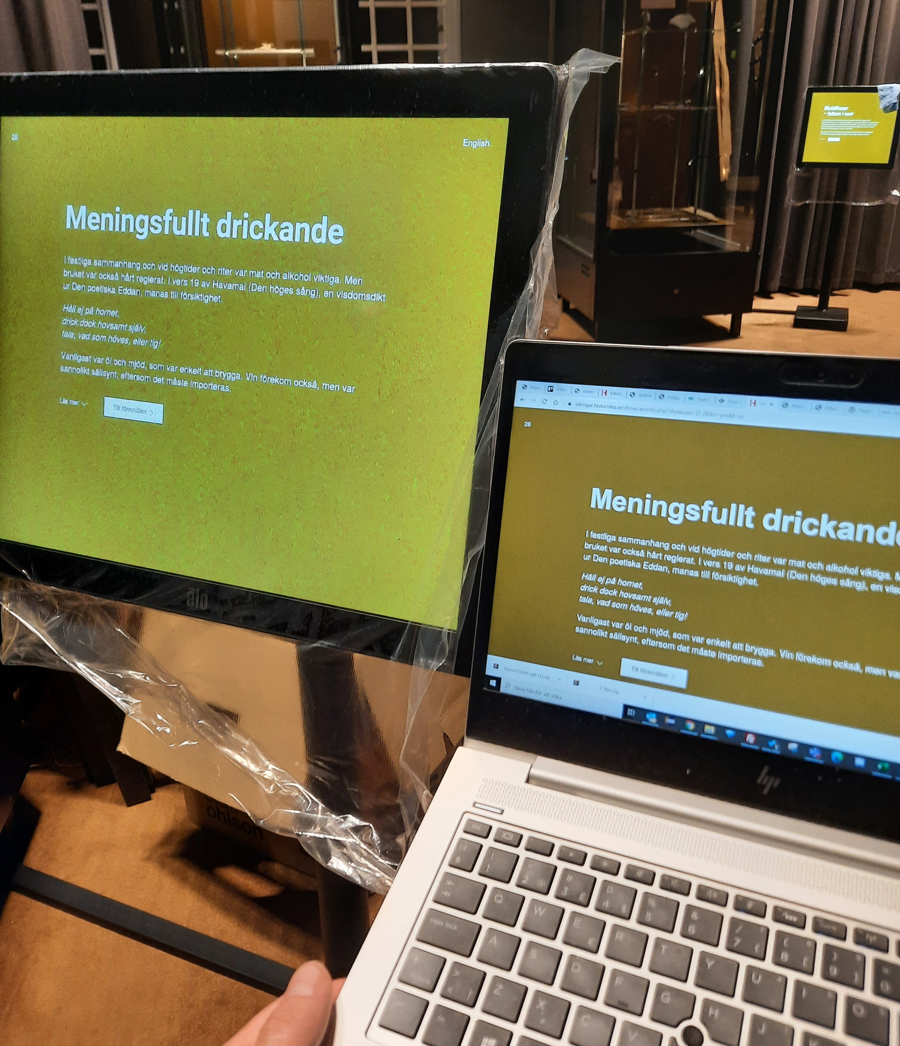
The world of the Vikings is not the first exhibition within National Historical Museums where we worked with digital texts on a larger scale. One idea we took with us from the work on the exhibition Medieval Massacre – the Battle of Gotland 1361 at The Swedish History Museum, which opened in 2014, was that the screens would initially function as signs and thus provide an overview of the exhibition space. From a distance you only see headlines, such as ” The sources for what we know” or “Most men were farmers”. Then when the visitor gets closer, the text is visible, which is in two levels. The design philosophy is minimalistic. The graphic design and typography are only there to mediate the content and help the user navigate. As few elements as possible make the application easier to use because the user thus has fewer choices to decide on. In addition to the language selector and “Show more” to read a more detailed text, there is a highlighted button “Objects”. In addition, there is a function to explain advanced words and concepts, these words are underlined, and a click opens a pop-up.
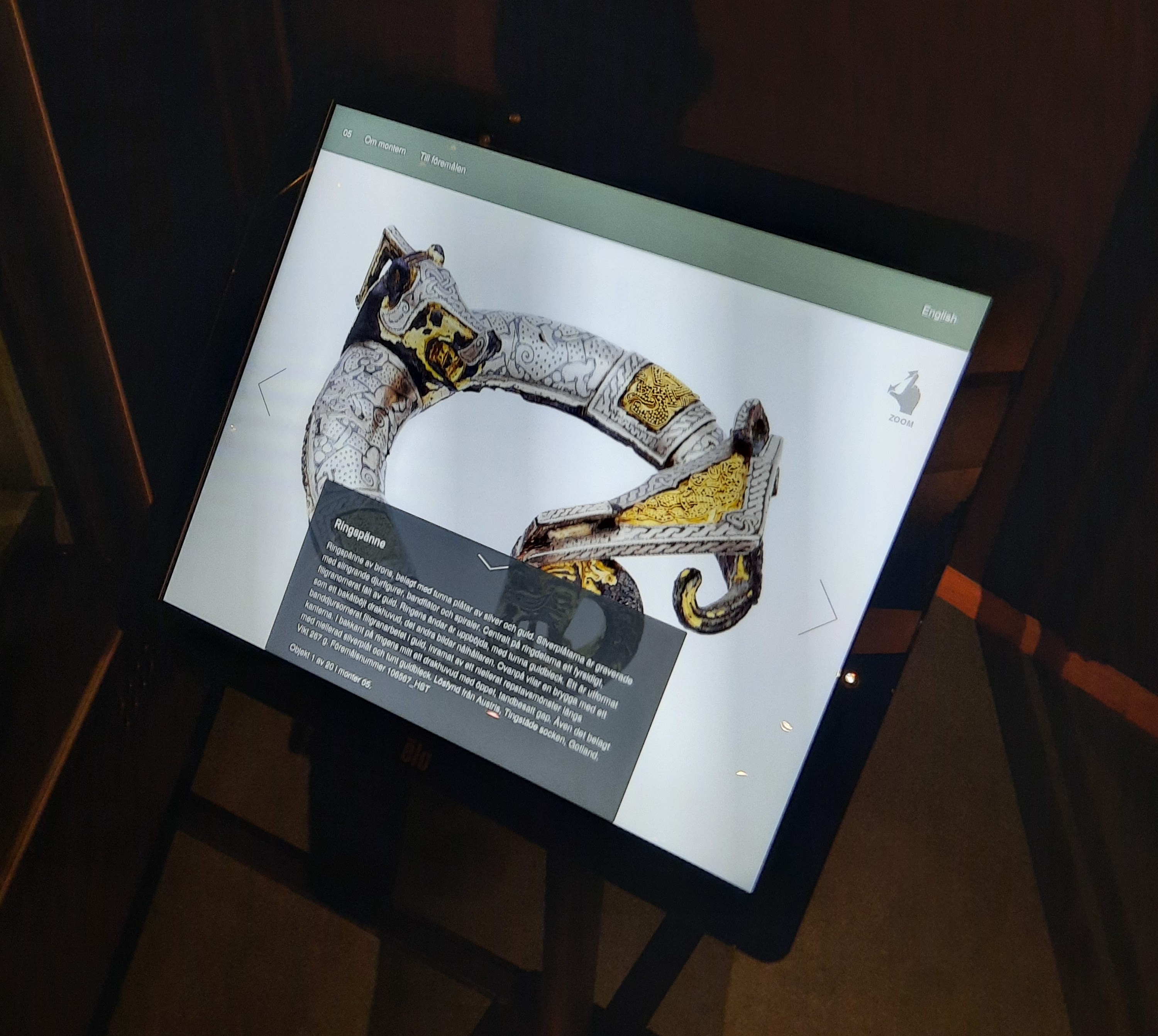
One of the screens in the exhibition shows the detail level
The next level lists images of the objects from the display. Clicking on an image will take you to the detailed level, where in addition to a descriptive text, there are one or more very high-resolution images that can be enlarged and rotated. We use IIIF-technology and a “viewer” called OpenSeadragon. In the detail view, you can also choose to browse through all the objects without having to go back to the overview. The different levels have two modes, one for the screens at the museum and one used in mobiles, iPads and computers, but basically the same page is displayed with a slightly different layout.
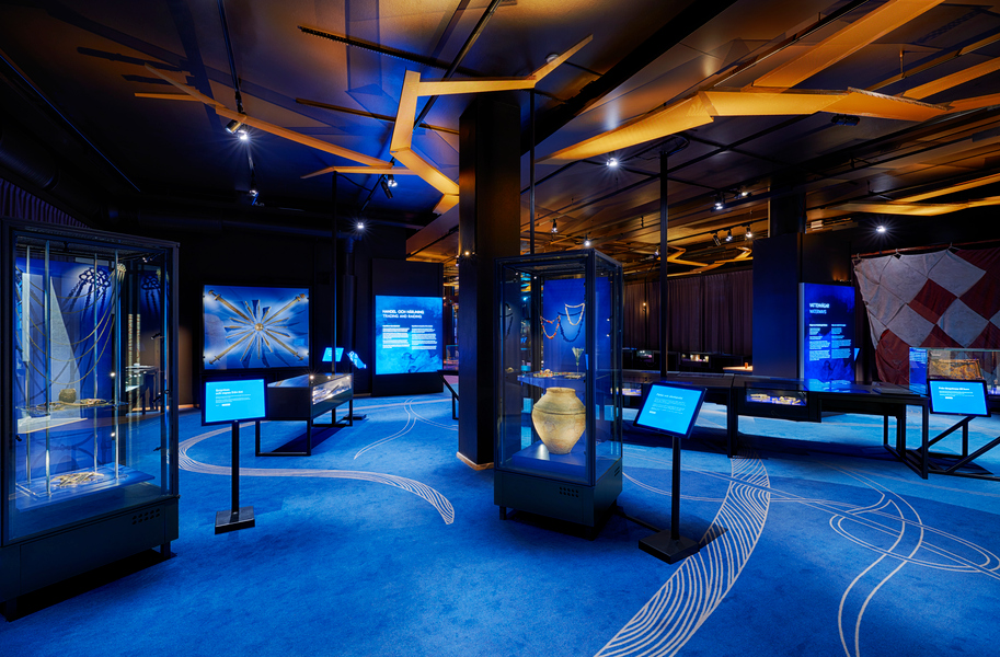
View of the exhibition room, theme Trading and raiding.
The design follows the overall exhibition design and uses the same thematic color coding. There are ten themes with an introductory text on the wall, the only printed text in the exhibition! The default screen shows white text on a colored background. The idea is that the screens in this way help to clarify the themes whose colors are also found in the carpet and the display backgrounds.
Many parameters play a role in how colors are perceived, including the characteristics of the screens and the ambient light. To get the color matching, therefore, me and the designer Jenny Marchi made adjustments on site towards the end of the production when the lighting was in place. We also reduced the brightness to find a suitable level in relation to other lighting. This work was simplified by the ELO-View monitoring system where brightness and other screen properties can be set for several or all screens at once.
Color adjustment of the screens
System architecture
The core of the system is a inhouse-developed web application based on HTML/PHP/JS/CSS and w3.css.
As mentioned earlier, there is no room for longer texts in our collection management system Adlib at the moment. In addition, there are no editing tools for text. We needed formatting; bold text, italics, paragraph breaks, etc. etc. For that reason, we set up a WordPress instance, the content management system that is primarily used for our other websites. The system is established and contains all the functions we need and has open-source code. In addition, it is possible to fetch posts via an API. This means that the front end is our inhouse-developed app but this app fetches information from WordPress as well as from our Collection Management System.
Another problem had to do with the photos, we wanted the ability to deep zoom and therefore set up a separate IIIF-server for this project. We will implement the use of IIIF on a larger scale for our collections, but this infrastructure is not yet in place.
The exhibition structure and all object information (including shorter descriptive texts) are in the collection database, Adlib, where there are also links to the longer texts and to the high-resolution images (on the WordPress and the IIIF server). The web application thus primarily asks questions to the object database, whereby in some cases it receives a link in response and uses this link to retrieve more information from another API (WordPress and IIIF).
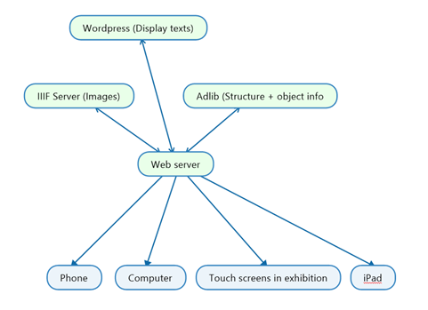
A risk with only digital information is that you become dependent on technology, and technology can, as we all know, fail. Therefore, stability and security become the highest priority. A weak point is that three servers and two APIs need to be available. In addition, it is demanding for the system to ask so many questions to APIs. For that reason, we built a caching system and those who work with updating content in the various systems need to go into a password-protected admin tool for the updates to take effect.
Accessibility
All our self-developed websites and apps follow the web accessibility guidlines. We collaborate with Axess lab who are experts in accessibility and follow WCAG 2.1. The mounting of the touch screens is, as previously mentioned, made so that everyone, even those in wheelchairs, can use them. We have done contrast checking of text against background with a tool called Color Contrast Analyzer.
Results
At the time of writing, the system has been in operation for about two months. The usage has been high and we have, with the help of Google Analytics, seen that we have between 10,000 and 30,000 page views per day. Most from use inside the museum. We have received mostly positive feedback but plan to do more qualitative research with interviews and possible focus groups on site.
Programming and graphic design as well as interaction design have been done inhouse. Those who mainly worked with the project are: Lasse Hedman, text. Jenny Marchi, graphic design. Me and Mikael Lettestad, coding. API configuration and database customization, Fredrik Andersson.
Feel free to contact me at wilhelm.lagercrantz@shm.se or 08 5195 57 25 if you want to hear about the work with one of the sub-processes in more detail.
You find the web/mobile version here: vikingar.historiska.se
In addition to the information system that I wrote about in this blog post, the exhibition contains several other digital productions that I intended to write about later. A game that teaches you how much resources it took to build a Viking ship, a touch screen application about runes and trading posts and a VR room with a digital reconstruction of a Viking-era stave church.