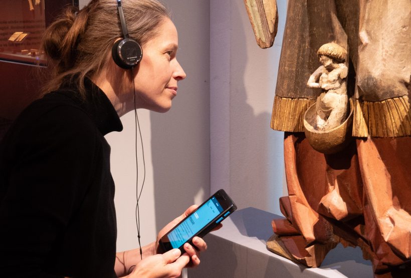
The visitor experience is central to the mission of museums, and audioguides are part of the essential offerings that our visitors expect to find. Although pre-recorded audio tracks are a well-established mediation method, it’s not always easy to implement a solution that works well in the long term.
Background and Challenge
We needed to review and renew the audioguide system for our seven museums and find a solution that met our specific needs while also being future-proof, cost-effective, and easy to manage. In this blog post, I’ll briefly describe the project from the initial idea to the finished solution.
Initially, the museums were using different systems for audioguides. Additionally, the contract with the supplier that provided audioguides for most of our museums was expiring, necessitating a new procurement process. This opened up the opportunity to create a more unified system that could work for all seven museums within the National Historical Museums (SHM). There were also potential efficiency gains, similar to those we’ve achieved with our websites, as I’ve written about in earlier blog posts: New Web Platform for National Historical Museums and The Economic Museum Launches New Website
We started by conducting a feasibility study to understand all the components that are involved in what we call “audioguides.” It’s not just about the content itself, the audio or video files, but about an entire system for storing, managing, playing, and navigating the content. One difficulty I discovered is that in everyday language, the term “audioguide” can refer to any of the following components or the whole system:
- The Story: Audio or video files (including sign language-interpreted videos).
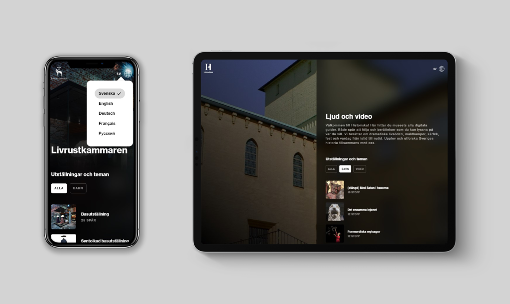
- Interface: The front-end that users interact with.
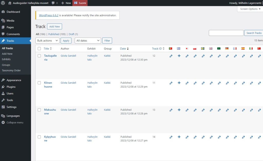
- Back-end: Where the museum staff uploads and manages content.
- Storage: This can happen locally on the device, in the cloud, or via a hybrid solution.
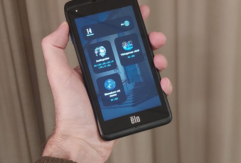
- Hardware: Playback happens through dedicated rental devices or visitors’ phones, computers, or iPads. It was also important that we could remotely monitor the rental devices we provide to visitors, which had been a challenge in the past.
Workshop and Needs Analysis
As a first step, we organized workshops with colleagues from our various museums. Together, we identified the weaknesses in our existing solutions and compiled a list of requirements for a new system. It became clear that we needed a solution that was reliable, robust, easy to manage and use, and that could also be used on visitors’ own mobile devices.
One challenge was to find boundaries. Technically, it’s not difficult today to build an audioguide with endless features. However, managing such a solution can become difficult, and for many users, it could also become complicated to use. Instead, our strategy was to focus on a streamlined audio playback app and see it as part of a larger ecosystem of solutions, including our websites and other apps available in the “Digital Companion” and on the web. Think of how your own phone works: Spotify for audio and music, YouTube for video, Twitter for text, etc.
After the workshop, I started conducting market research to see what ready-made solutions were available. There were indeed suppliers offering interesting systems, but after assessing our unique needs, we realized that developing our own solution would allow us to tailor the system to exactly what we wanted—flexibility, control, and seamless integration across all our museums. That’s not to say other museums should draw the same conclusion; there are specific circumstances at SHM that led to this decision.
Why We Chose to Build Our Own Solution
There were several reasons we chose to develop our own solution. First, we already had a strong organization for web development and management within the National Historical Museums, along with an established partnership with the digital agency Bazooka. Moreover, we use WordPress as the CMS for all our websites, and we knew there were no critical backend features that WordPress couldn’t handle. The backend requirements, therefore, weren’t particularly complex, according to my analysis.
Since we also wanted the solution to work on visitors’ own devices—a feature that has become increasingly requested—a web-based solution was the most logical choice. With this new web-based system, visitors can seamlessly access audioguides on their own devices—whether they’re using a smartphone at the museum or an iPad from the comfort of their home.
We also already had an agreement with a company, Mevida, that manages AV equipment, including support, installation, and purchases for our exhibitions. So, hardware procurement, support, and installation could be handled through this existing agreement. For us, this meant greater efficiency with fewer contracts and fewer suppliers. Additionally, there would be a single point of contact for our museum staff when something needed fixing in exhibitions or at the visitor entrances.
Responsive Design
An important aspect of developing our own solution was ensuring the design was responsive, meaning it would work equally well on all types of devices, from small mobile screens to larger tablets and computers. The layout and functionality are consistent across all museums, but we’ve also made it possible to customize the appearance for each museum by including their logos and background images to reflect each museum’s identity. The structure and all content, including images and text, are fully configurable for each museum.
Integration with the Digital Companion
One of the greatest advantages of developing our own solution was the ability to integrate the web app with the Digital Companion concept, which I’ve previously written about in a blog post: Digital Companion
The Digital Companion is intended as a long-term solution that can gradually be expanded with more features and adaptations depending on the specific needs of each exhibition or museum. The audioguide thus became part of this broader strategy to enhance the visitor experience.
Links to our audioguides
- The Royal Armoury
- The Hallwyl Museum
- Skokloster Castle
- The Swedish Holocaust Museum
- The Tumba Paper Mill Museum
- The Economy Museum
- The Swedish History Museum


