Today we are launching a brand-new concept for our museums, the Digital Companion. The idea is that the companion should be your support during the exhibition visit, where information and knowledge are always easily accessible in your palm.
First up are the Swedish Holocaust Museum and the Swedish History Museum, and later this year The Economy Museum will also launch a Digital Companion.
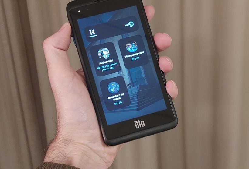
The design is meant to mimic that of a mobile phone with apps in the form of clickable icons. Once inside an app, you easily get back to the home page via a home button that is always available at the top. During a museum visit, there is no time to learn new user interfaces, everything must be as intuitive as possible. By simulating a device that most of us use daily, we lower the threshold for use.

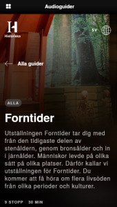
Example of how it looks inside the companion when an audio guide has been selected. The button in the upper left corner takes you to the home screen.
The apps available at launch are an object explorer, audio guides, and a timeline but the concept allows us to add more as needed. In connection with the opening of The Economy Museum, visitors will for example be able to play games and answer dilemma questions via the companion.
An overall design philosophy has been to design apps that make the content accessible to as many people as possible both during the museum visit and before and after the visit. This means that the apps work in rental units (see picture), on the visitors’ mobile phones, touch screens in the exhibitions, laptops, and desktop computers or any other machine with internet access and a browser.
In connection with the companion, we also premiere our new audio guide app. It follows the design philosophy above and is accessible via phone, tablet, and computer. The content is updated using WordPress just like other websites within our agency. In this way, we get synergies on several levels, both in technical management, content creation, optimization, and evaluation.
A few of the apps designed to work with our concept:
https://museumforintelsen.se/tidslinjen
https://vikingar.historiska.se/
https://guide.tumbabruksmuseum.se/